Graphic World

Categories
Learning Post

The 5 best new 3D tools for June 2017

We’re alreay halfway through the year and developments in the world of 3D artdon’t show signs of slowing down any time soon. With plenty of tools and updates hitting the scene, let’s dive in with the top 5 tools for June.

1. Laubwerks

Laubwerks are touted as the best foliage kits in the business

If you’re into architectural visualisation or environment work then it’s very likely that you will need foliage of some kind. Over the last few years Laubwerk have produced some of the best quality foliage packs around.

What makes them special is not just the excellent models and accompanying textures but the implementation. Not only doe they ship plugins for various host apps but the Laubwerk player also lets you dial in attributes for your plants, from age of plant to the season, with materials and meshes responding appropriately.

Now, Laubwerk have released their first shrub pack, as well as a new Maya player, bringing these top quality kits to an even bigger user  base.

2. Modo 10.1

10.1 adds a large feature list to the previous release and will please modelers

Not that long ago the foundry announced their new model for development of modo and now we are seeing the results of the second edition in this series, 10.1.

10.1 is solidly focused on modelling and brings to the table far more than can be talked about here but the highlights are some huge additions and improvments to MeshFusion, the versatile Boolean system.  With similarities to Zbrush’s shadowbox it allows the user to create Booleans from different angles, making complex shapes far easier than traditional methods.

Also a big new feature, and one that joines forces with other areas of modo, is the procedural modelling system,. With many uses it’s hard to describe fully here but see it as a way of creating and editing models non destructively, with operators able to be freely moved, adjusted and animated.

10.1 is a big release so head to the product page to read more and see some of the demo videos.

3. Guide to GPU rendering

In depth guide to rendering on the GPU is free to all registrants

The battle for rendering supremacy is raging away, with both GPU and CPU camps having good points to make. However understanding the benefits of one system over another is not always that simple but Chaos Group Labs have come to the rescue, with this in depth and best of all, free guide on how working with a GPU can make your life as a cg artist easier, or at least quicker.

Of course there’s a slant towards V-Ray but that is in some ways irrelevant. The pros and cons are the same and the authors have put together a really comprehensive guide, covering everything from compute power background and history to what the future could hold.

4. Spline connect

The most efficient way of connecting spline segments is only $15

Default Cinema 4D installs don’t provide a way of easily connecting spline objects but Mike Udin, has the answer. His new Fast Spline Connect plugin, available from cgtools, makes it about as simple as any command can be.

At just $15 it’s impossible to resist if you ever work with splines and should really be a part of the standard feature set. Seeing as Cinema 4D has such a large user base we can certainly see this being a popular plugin.

5. Autodesk Industry collections

Autodesk’s new collection is a rent only affair, although cheaper than pervious iterations

If you are a fan of Autodesk software but your budget prohibited signing up tho their subscription service there’s some good news. The big ‘A’ have reshuffled their software suites into ne ‘industry collections’, which contain the same core products as before, although obviously not softimage, and they come out at a fairly substantial reduction in yearly cost (around $300 depending on your choices).

On top of this the new collections also sign you up to a new cloud service, for rendering, storage and other tools like the character builder.

There will no longer be the option to buy a perpetual license however, so if you really need to use the software plan ahead.

Categories
Landscape Post

20 Aluminum Pergola Design Ideas

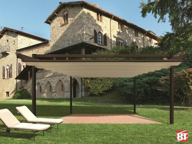
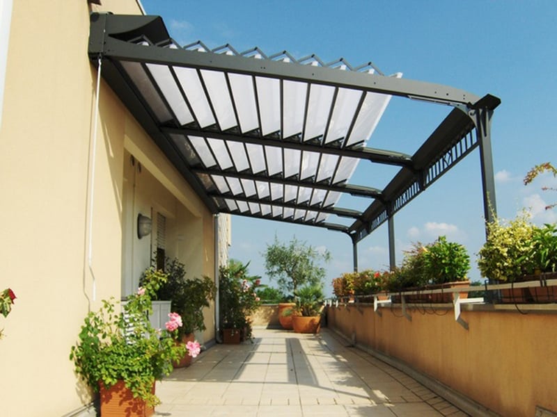
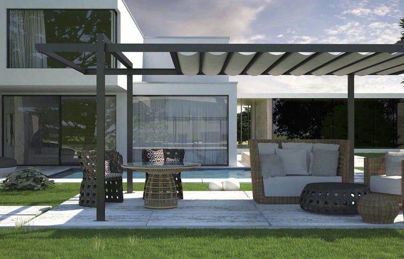
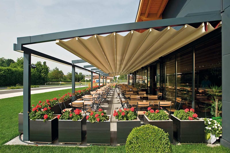
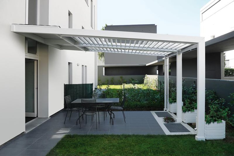
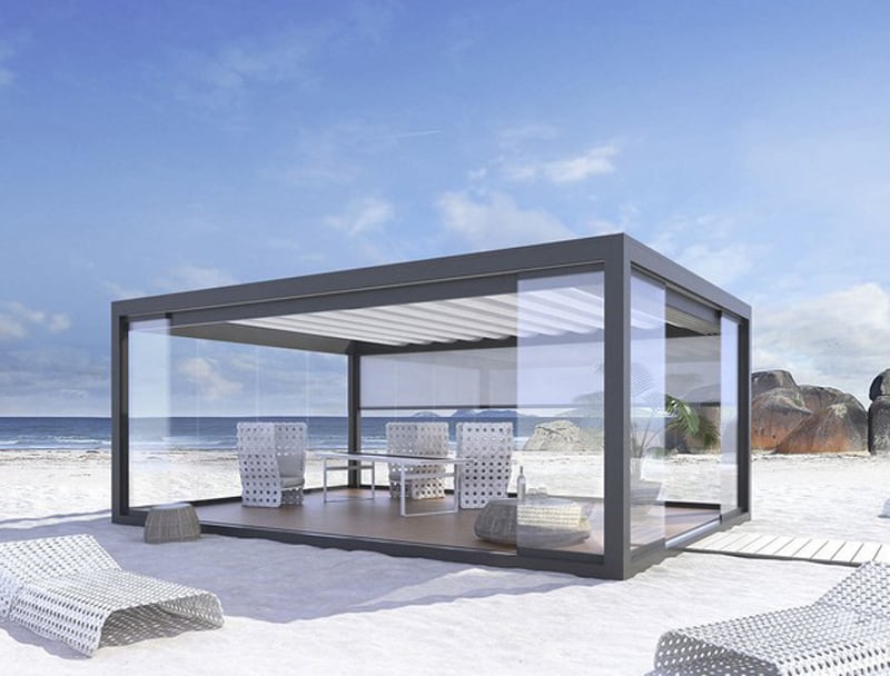
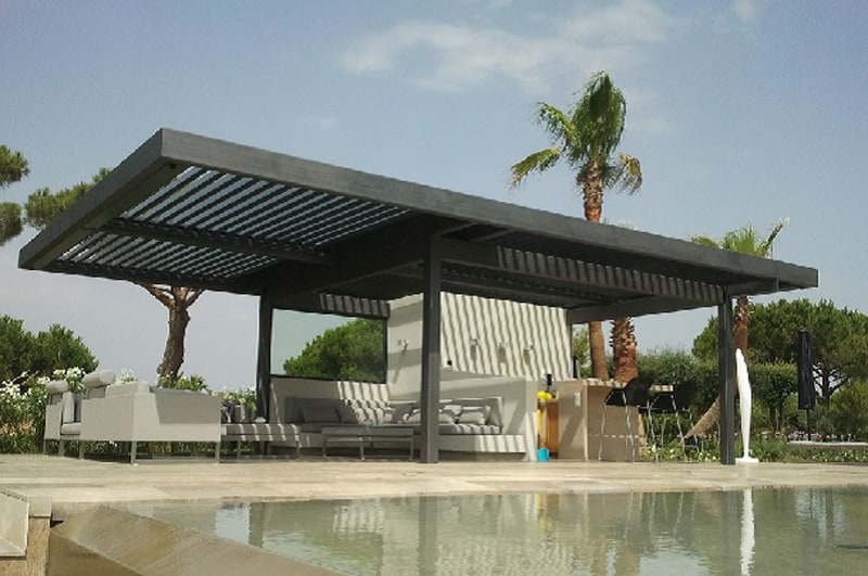
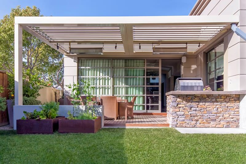
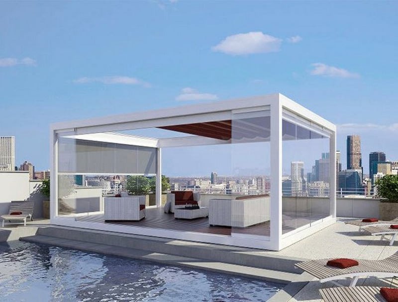
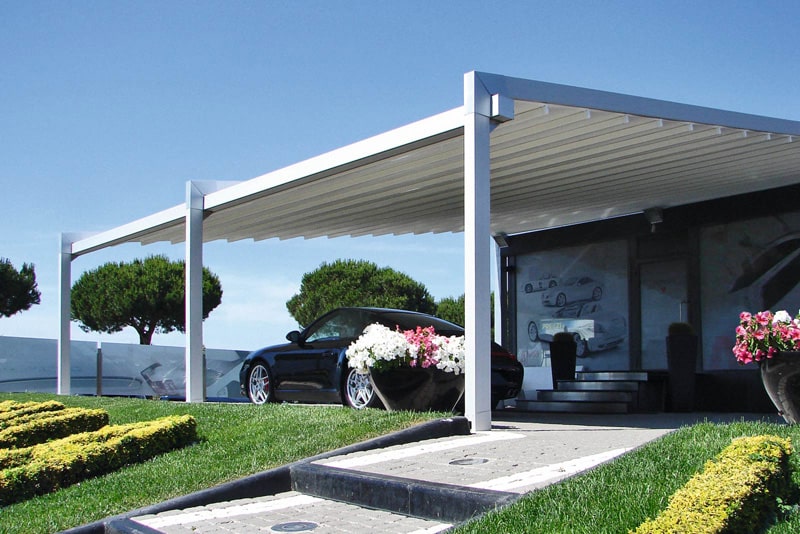
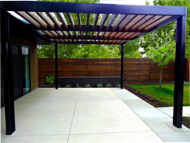
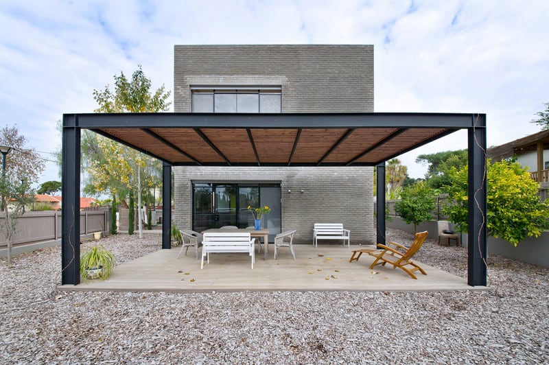
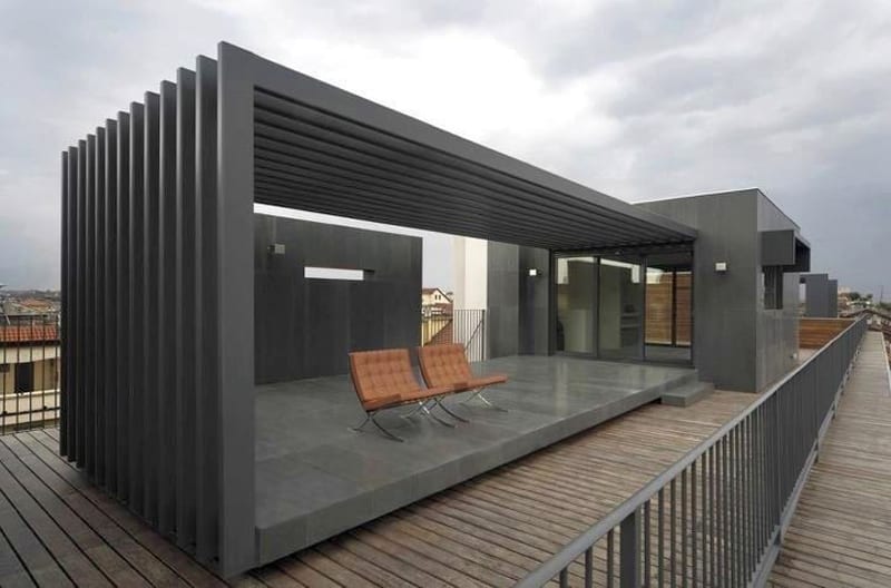
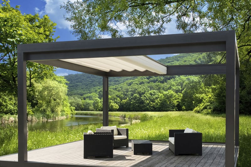
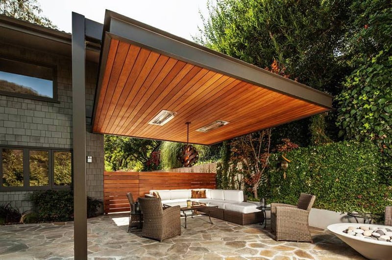
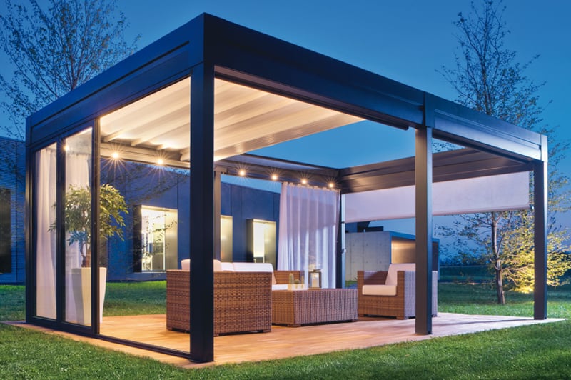
A pergola is an ideal for creating beautiful environments in your garden and terrace. Pergolas are usually custom-built and made of wood, but aluminum and vinyl pergolas are growing in popularity because they last a long time and need almost no maintenance to continue looking good. Since aluminum and vinyl require special tools and techniques to work with, these materials are most commonly available as pre-manufactured kits. Add beauty and shade without the maintenance of wood with an Aluminum Pergola. Aluminum pergola is the right choice to be applied in a place that experiences the changing climates very often. Aluminum is a lightweight material and arguably cheap. Besides, this is also stainless. This material is suitable to be applied at home with a variety of themes even if you apply a modern theme in your home.  Basically, garden will always fit combined with any theme. This also applies for the pergola. Therefore in this article we will show some examples of pergola that use aluminum as the primary material. Enjoy our beautiful collection of 20 Aluminum Pergola Design Ideas. Check this out.

designrulz-Aluminum pergola (1)


designrulz-Aluminum pergola (1)designrulz-Aluminum pergola (2)designrulz-Aluminum pergola (3)designrulz-Aluminum pergola (4)designrulz-Aluminum pergola (5)

designrulz-Aluminum pergola (6)


designrulz-Aluminum pergola (7)designrulz-Aluminum pergola (8)designrulz-Aluminum pergola (9)designrulz-Aluminum pergola (10)designrulz-Aluminum pergola (11)designrulz-Aluminum pergola (12)designrulz-Aluminum pergola (13)designrulz-Aluminum pergola (14)designrulz-Aluminum pergola (15)designrulz-Aluminum pergola (16)

summer landscape with river and blue sky

designrulz-Aluminum pergola (18)designrulz-Aluminum pergola (19)

Categories
Landscape Post

33 Ideas for Your Outdoor Space: Pergola Design Ideas and Terraces Ideas

Having a place where you could rest and take a good look at the surroundings would certainly be a great thing.  We have prepared for you 33 ideas for your outdoor space: pergola design ideas and terraces ideas  which are functional and practical and also suitable for every garden or terrace. Any of these could give you a place where you can breathe in fresh air and where you can see the vast heavens. That would be a relaxing view which can take away all your stress from a day’s work. If you are getting ready to furnish your terrace patio or porch you should definitely plan ahead.

also view: 40 Pergola Design Ideas Turn Your Garden Into a Peaceful Refuge

designrulz-terrace (1)


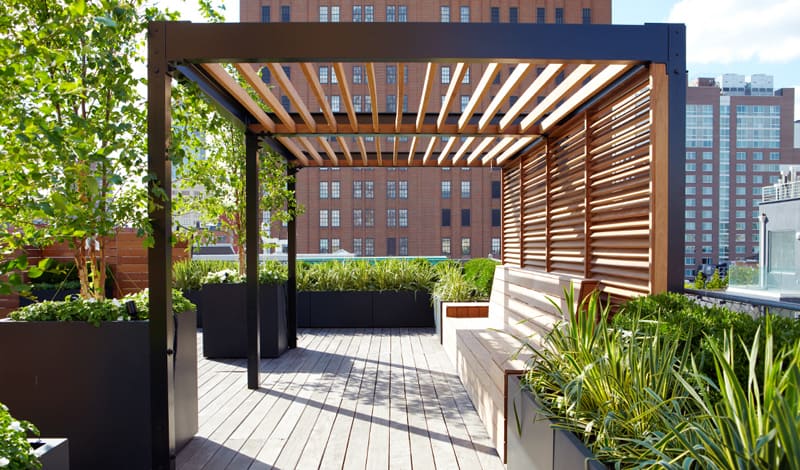
A pergola in the garden has many advantages – it is easy to build and offers numerous design options – it can bring a refreshing coolness and covered with an awning, or used as decoration and to really highlight your garden. Pergola designs are particularly effective where there is a floor covering – a garden path, a patio area or a terrace with wooden floor are just a few examples. This simple structure gives the options to setup a seating that looks fresh and inviting with colorful flowers and plants.

designrulz-terrace (2)


A modern design may fit your modern mansion but there are still  a lot of details to go through because in the end you need to have a place to relax, entertain and dine with family of friends in the highest grade of comfort possible. Being surrounded by vegetation will not only bring a mesmerizing breathtaking apparel but fresh air as well. If you build a pergola in the garden in the immediate vicinity of the house, you will be able to always enjoy a place of rest. So that you do not bother, you can shield the pergola with awnings, or secure it by a structure made of wood and vines to protect your privacy. This is a modern pergola design and has a nice contrast to the classical columns.

designrulz-terrace (3)


designrulz-terrace (4)


designrulz-terrace (5)


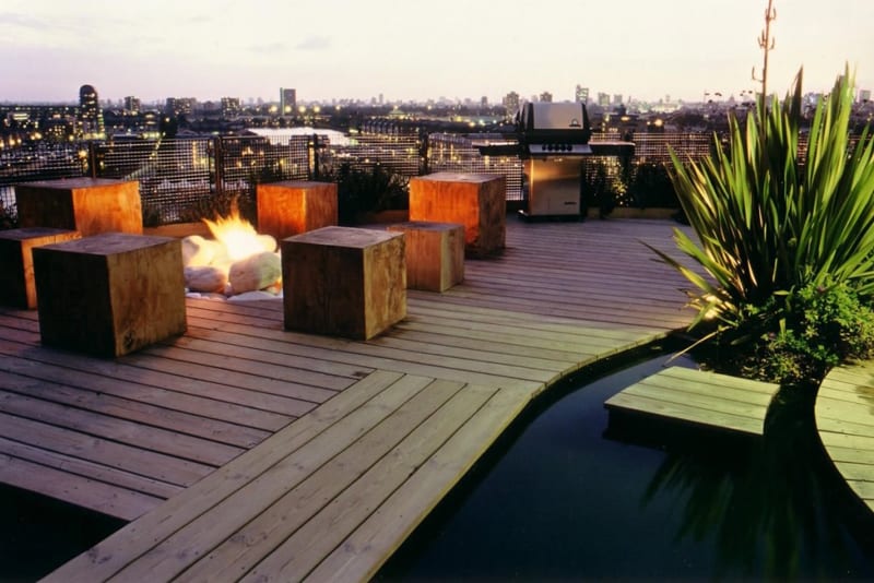
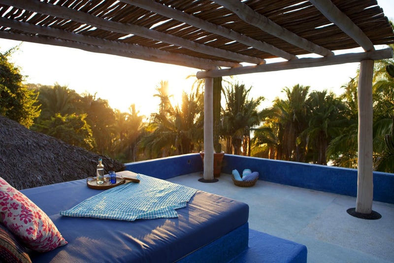
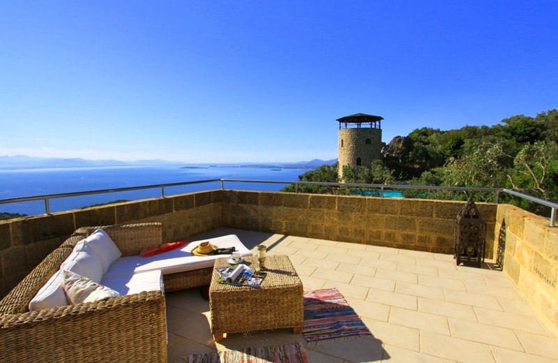
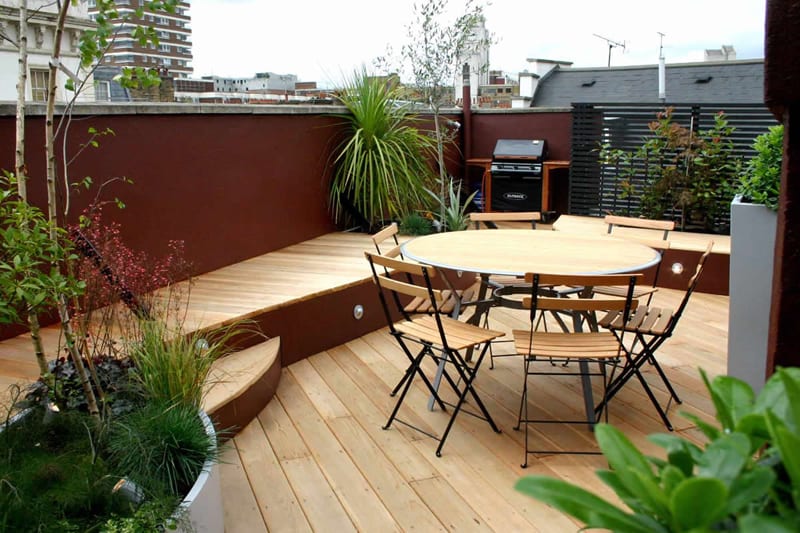
roof terrace-designrulz (1)roof terrace-designrulz (1)roof terrace-designrulz (2)roof terrace-designrulz (3)roof terrace-designrulz (4)roof terrace-designrulz (5)roof terrace-designrulz (6)roof terrace-designrulz (7)roof terrace-designrulz (8)roof terrace-designrulz (9)roof terrace-designrulz (10)roof terrace-designrulz (11)roof terrace-designrulz (12)roof terrace-designrulz (13)roof terrace-designrulz (15)roof terrace-designrulz (16)roof terrace-designrulz (17)roof terrace-designrulz (18)roof terrace-designrulz (20)roof terrace-designrulz (21)roof terrace-designrulz (22)roof terrace-designrulz (23)roof terrace-designrulz (24)roof terrace-designrulz (25)roof terrace-designrulz (26)roof terrace-designrulz (27)roof terrace-designrulz (28)roof terrace-designrulz (29)

Categories
Post

29 Bathrooms with Stylish Floating Sinks

 A gallery of a wide variety of stylish bathrooms designed to include floating sinks, showcasing the design styles of many different bathrooms.

Welcome to our gallery featuring a wide variety of Bathrooms with Floating Sinks.

Welcome to our gallery featuring a wide variety of bathroom designs with floating sinks and vanities.

There are so many different ways to design a bathroom space, and you will see a large variety of these designs in our gallery.

While some bathrooms are a grand space full of golden accents and seemingly fit for a king, many times the bathroom must be confined to a smaller area.

Floating sinks are a great way to take up less space for these smaller bathrooms. Even if the sink is still a large one, since they are mounted to a wall and do not extend to the floor, they always create the illusion that they are taking up less space.

While these sinks are useful in small spaces, they are not restricted for use when space conservation is important. You will notice that there are many floating sinks with a “trough” style design.

These large sinks make it possible for multiple people to be able to use the sink at the same time. They also eliminate the need for  extra plumbing for additional units.

We wanted to feature a wide range of bathrooms that feature these floating sinks to give you a better idea of how to incorporate them into a design. We love the look of the sinks and we know that you will too once you see them in these finished bathrooms!

In many of the images shown below, you will notice that there are drawers or cabinet spaces below the floating sinks. The fact that they do not extend to the floor allows for this extra storage space and can be perfect bathrooms.

Not only are the sinks a great feature in these rooms, but the design styles are all unique and appealing. Whether you have a budget without a ceiling, or just some spare cash to work renovations into your bathroom, there is something for you here.

Please enjoy our gallery and be sure to pay attention to the floating sinks featured, as well as the incredible designs in these bathrooms!

This bathroom is covered in large tile from the floors to the top of the walls. Less than halfway up the wall, the tile changes to a lighter shade of grey, which gives the room some depth. The utilities are clean and white, with chrome faucets and piping. The stained wood door frame and window frame are accented as they are the only variation of color in the space.
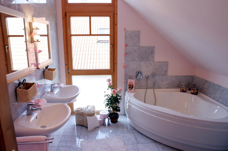
This bathroom is covered in large tile from the floors to the top of the walls. Less than halfway up the wall, the tile changes to a lighter shade of grey, which gives the room some depth. The utilities are clean and white, with chrome faucets and piping. The stained wood door frame and window frame are accented as they are the only variation of color in the space.

The angled ceiling makes this bathroom a cozy small space. The tub is tucked in the smallest corner of the room with tiles running along the perimeter of the bath and faucet, serving as a backsplash. A window with frosted glass panes on both the top and bottom sides allow for natural light to fill the room. Two small floating sinks are featured.

The angled ceiling makes this bathroom a cozy small space. The tub is tucked in the smallest corner of the room with tiles running along the perimeter of the bath and faucet, serving as a backsplash. A window with frosted glass panes on both the top and bottom sides allow for natural light to fill the room. Two small floating sinks are featured.

This large floating sink is accommodated by a white wooden bench beneath it. This allows for little people to sit next to one another while washing up. The floor is covered in square white tile, and the walls are covered with vertical white wood panels running two thirds up the wall. The outer surface of both the bath and floating sink are sky blue, which helps to accent the space.

This large floating sink is accommodated by a white wooden bench beneath it. This allows for little people to sit next to one another while washing up. The floor is covered in square white tile, and the walls are covered with vertical white wood panels running two thirds up the wall. The outer surface of both the bath and floating sink are sky blue, which helps to accent the space.

Source: Zillow Digs™

This is a fairly large bathroom with a beige colored floor and wall behind the toilet. The opposite wall is white, and features a glass wall shower, as well as a floating sink. The room is well lit by both natural light and artificial lighting around the mirror.

This is a fairly large bathroom with a beige colored floor and wall behind the toilet. The opposite wall is white, and features a glass wall shower, as well as a floating sink. The room is well lit by both natural light and artificial lighting around the mirror.

Brown tile covers the walls of this bathroom, with a lighter beige accent tiles around the floating sinks and mirrors. The lighter tiles divide the darker, giving this room a high sense of style. The floor features brown tile as well, however the pattern is different from the walls, so the color and style is not overwhelming.

Brown tile covers the walls of this bathroom, with a lighter beige accent tiles around the floating sinks and mirrors. The lighter tiles divide the darker, giving this room a high sense of style. The floor features brown tile as well, however the pattern is different from the walls, so the color and style is not overwhelming.

See more of this collection here. Designed by FAP Ceramiche.

25 Most Popular Kitchen Designs

This bathroom features a section of large dark tile behind the sink and in the lower half of the shower. The small square tile backsplash runs along the wall behind the tub, as well as above the sink and in a vein through the middle of the shower. A slanted ceiling features a skylight, which helps to keep the space bright.
This bathroom features a section of large dark tile behind the sink and in the lower half of the shower. The small square tile backsplash runs along the wall behind the tub, as well as above the sink and in a vein through the middle of the shower. A slanted ceiling features a skylight, which helps to keep the space bright.

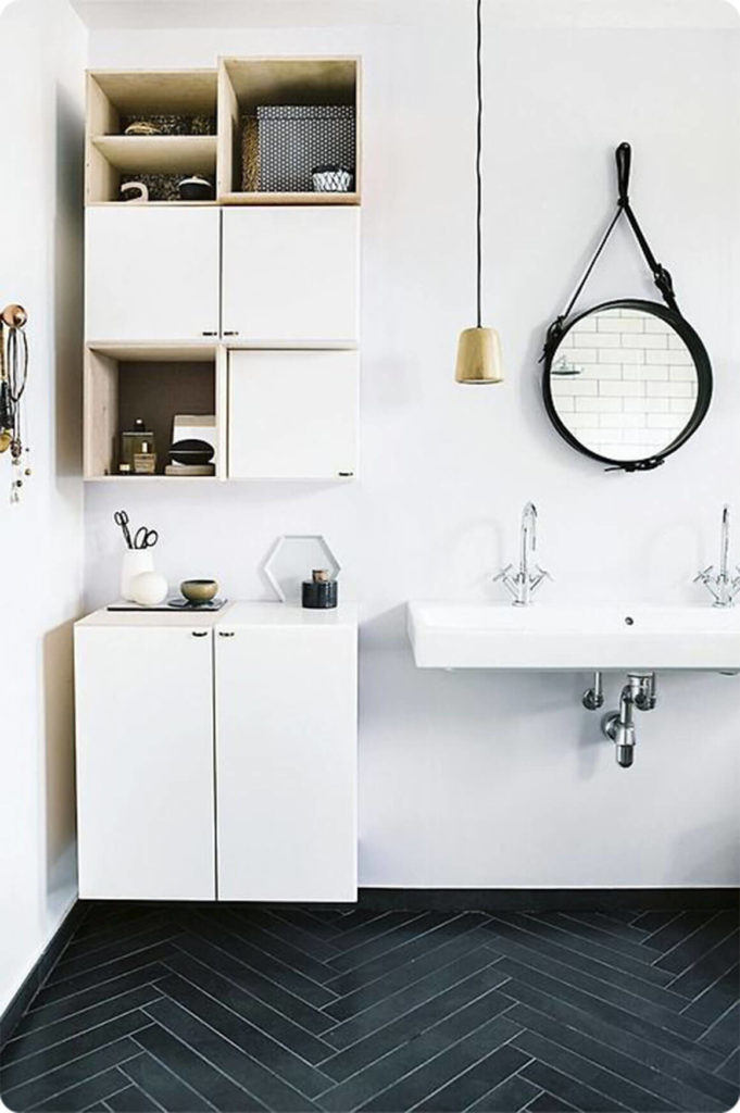
This bathroom has a stylish design with black wood paneling in a unique pattern on the floor. White walls and cabinetry contrast the dark floor, and a low hanging pendant light works with the circular mirror to add to the modern atmosphere in the room.

This bathroom has a stylish design with black wood paneling in a unique pattern on the floor. White walls and cabinetry contrast the dark floor, and a low hanging pendant light works with the circular mirror to add to the modern atmosphere in the room.

Source: Zillow Digs™
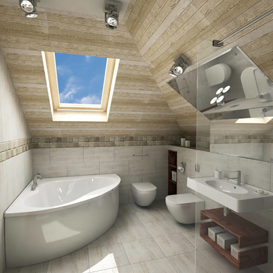
A corner bath sits directly beneath a large skylight in this bathroom, with a toilet and bidet in the adjacent corner. The ceiling is angled and there is a vein of square tile acting as a defining line between the walls and ceiling. A floating sink sits to the right of the toilet area and features a wooden stained shelf below for storage.
A corner bath sits directly beneath a large skylight in this bathroom, with a toilet and bidet in the adjacent corner. The ceiling is angled and there is a vein of square tile acting as a defining line between the walls and ceiling. A floating sink sits to the right of the toilet area and features a wooden stained shelf below for storage.

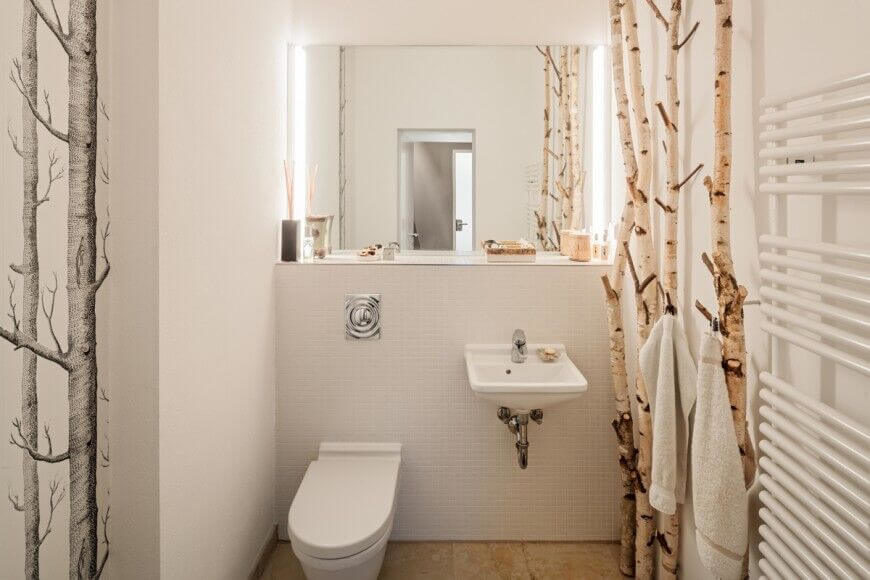
This unique space is accented by the thin birch trees standing to the side of the sink and opposite of the shower, These limbs act as both accents for the room as well as hangers for towels and clothing. Adjacent to these is a floating sink and large mirror, with a toilet directly next to the sink.

This unique space is accented by the thin birch trees standing to the side of the sink and opposite of the shower, These limbs act as both accents for the room as well as hangers for towels and clothing. Adjacent to these is a floating sink and large mirror, with a toilet directly next to the sink.

See more of this home here. Designed by BERLINRODEO.
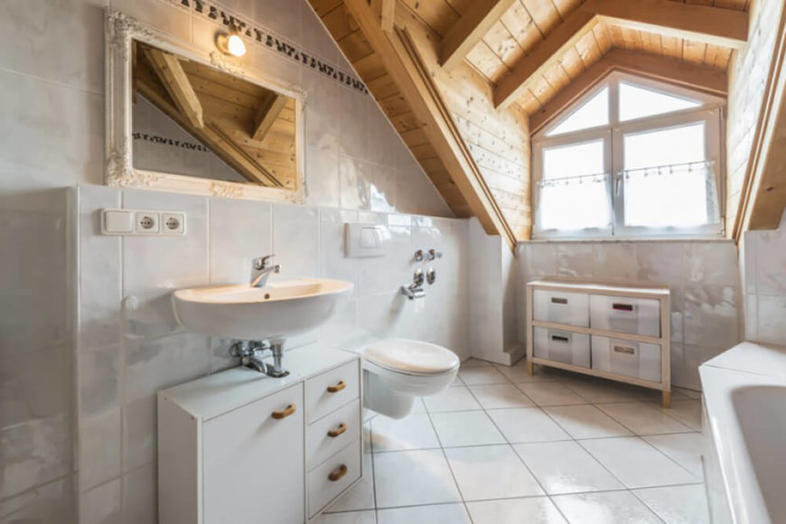
A section of wall protrudes from the surrounding wall, and features a floating sink, a toilet, and a cabinet below the sink for storage. The ceiling contrasts the white tile with its golden wood tones, and the large window lets in plenty of natural light to illuminate the room.
A section of wall protrudes from the surrounding wall, and features a floating sink, a toilet, and a cabinet below the sink for storage. The ceiling contrasts the white tile with its golden wood tones, and the large window lets in plenty of natural light to illuminate the room.

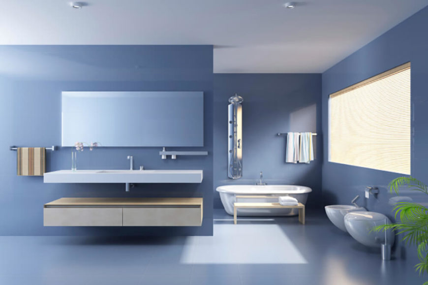
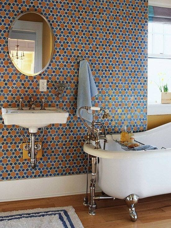
This bathroom features a wall covered in tile that forms a unique pattern. The blues and brown color works together to contribute to a calming atmosphere, white the clawfoot tub and floating sink add classical appeal. There is a large window near the head of the tub, which lets in light for the room.

This bathroom features a wall covered in tile that forms a unique pattern. The blues and brown color works together to contribute to a calming atmosphere, white the clawfoot tub and floating sink add classical appeal. There is a large window near the head of the tub, which lets in light for the room.

Source: Zillow Digs™
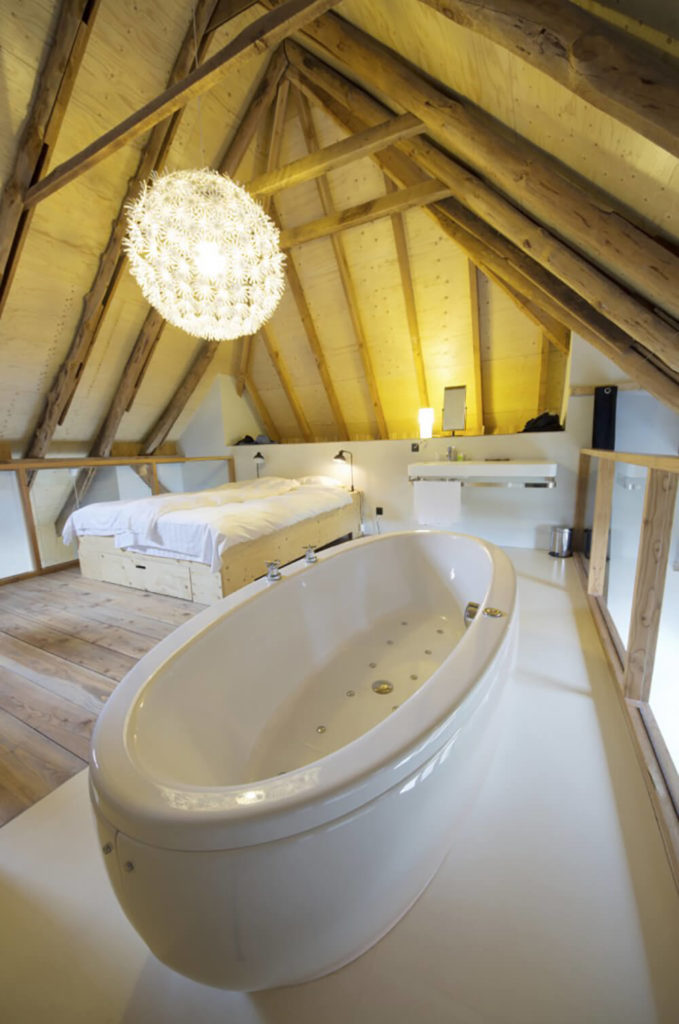
A large luxurious jet tub takes up a good amount of space in this room, and sits upon a light tile floor. You can see from the walls that this space sits on a loft in the upper section of the home. There is a floating vanity on the far end of the room. A large bed sits on a natural wood frame, matching the hardwood floor in the rest of the space.

A large luxurious jet tub takes up a good amount of space in this room, and sits upon a light tile floor. You can see from the walls that this space sits on a loft in the upper section of the home. There is a floating vanity on the far end of the room. A large bed sits on a natural wood frame, matching the hardwood floor in the rest of the space.

A modern style bathroom, this space features a light hardwood floor, which runs halfway up the wall and ends just below the mirrored cabinets. A long floating sink is featured just below the cabinetry, while a glass wall shower is featured on the opposite side of the room.

A modern style bathroom, this space features a light hardwood floor, which runs halfway up the wall and ends just below the mirrored cabinets. A long floating sink is featured just below the cabinetry, while a glass wall shower is featured on the opposite side of the room.

See more of this home here. Designed by Burnazzi Feltrin Architetti.
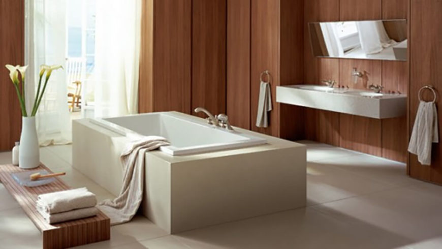
This bathroom has a very calming atmosphere, established by the rich wood panel walls and the large rectangular tub in the center of the room. A small table sits to the side of the tub and holds various toiletry items as well as decorative flowers, which also help to accent the room.

This bathroom has a very calming atmosphere, established by the rich wood panel walls and the large rectangular tub in the center of the room. A small table sits to the side of the tub and holds various toiletry items as well as decorative flowers, which also help to accent the room.

A small space holds a toilet, and floating sink, and corner mounted mirror. An accent wall takes up the corner space, and features a steering wheel decoration that doubles as a place to hang hand towels. The dark walls help to contrast the white utilities and white accent wall.

A small space holds a toilet, and floating sink, and corner mounted mirror. An accent wall takes up the corner space, and features a steering wheel decoration that doubles as a place to hang hand towels. The dark walls help to contrast the white utilities and white accent wall.

Source: Zillow Digs™
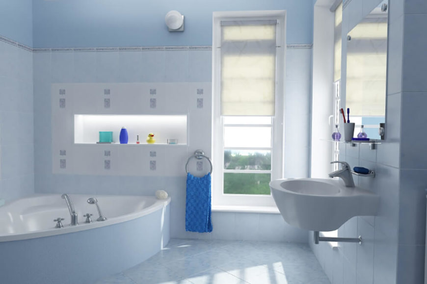
This bathroom features a light blue textured tile floor, and the tile runs up the entirety of the wall up to just below the ceiling. A floating sink hangs below a mirror with a small shelf for toiletries. There is a large corner tub, with a shelf just above the tub for storing toiletries and other decoration.
This bathroom features a light blue textured tile floor, and the tile runs up the entirety of the wall up to just below the ceiling. A floating sink hangs below a mirror with a small shelf for toiletries. There is a large corner tub, with a shelf just above the tub for storing toiletries and other decoration.

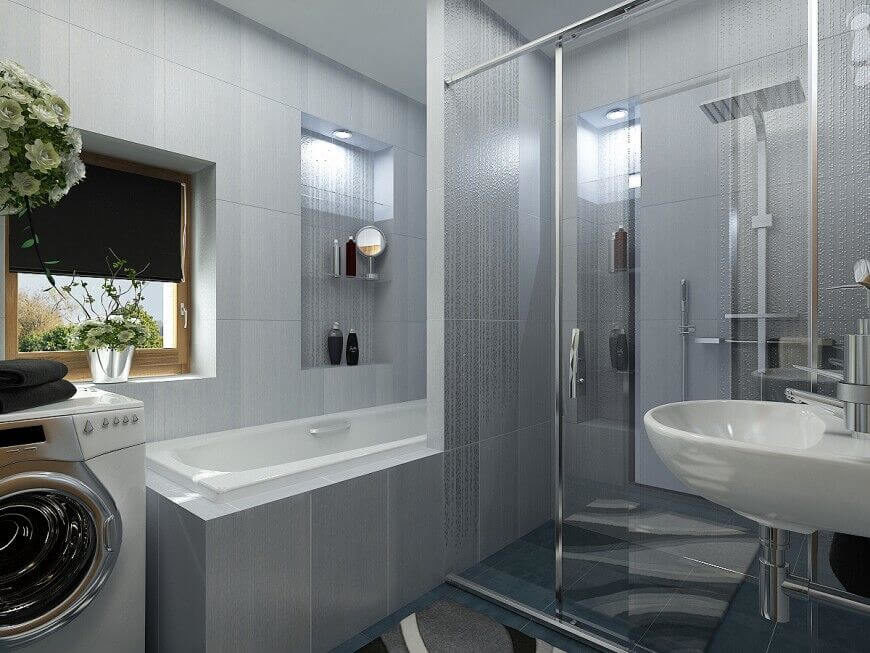
This bathroom shares a space with a washer and dryer, but there is still plenty of room to move around comfortably. Large grey tiles cover the walls and create a futuristic feel for the room. Notice the corner of a stylish carpet covering the floor. The bath and shower are taking up a large space, but their positioning helps to conserve area in the bathroom.

This bathroom shares a space with a washer and dryer, but there is still plenty of room to move around comfortably. Large grey tiles cover the walls and create a futuristic feel for the room. Notice the corner of a stylish carpet covering the floor. The bath and shower are taking up a large space, but their positioning helps to conserve area in the bathroom.

See more of this home here. Designed by Neopolis.
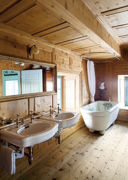
Natural wood fills this bathroom, covering the floor, the walls, and the ceiling. A clawfoot tub is featured in the corner between two windows. Directly to the left of the tub and window are two floating sinks sharing one large mirror.

Natural wood fills this bathroom, covering the floor, the walls, and the ceiling. A clawfoot tub is featured in the corner between two windows. Directly to the left of the tub and window are two floating sinks sharing one large mirror.

Source: Zillow Digs™

This bathroom has a bright and vibrant color scheme, with a checkered pattern on the wall behind the sink and counter. The unique counter space has various openings that reveal commodities like toilet paper, but they can also be hidden if necessary. The floating sink has a unique transparent glass structure.

This bathroom has a bright and vibrant color scheme, with a checkered pattern on the wall behind the sink and counter. The unique counter space has various openings that reveal commodities like toilet paper, but they can also be hidden if necessary. The floating sink has a unique transparent glass structure.

This angle reveals a view from inside the shower. You will notice a wavy pattern on the interior of the shower, while outside of this space the material transitions into grey tile. There is a floating sink located on the left, and a small doorway on the right of the far wall.

This angle reveals a view from inside the shower. You will notice a wavy pattern on the interior of the shower, while outside of this space the material transitions into grey tile. There is a floating sink located on the left, and a small doorway on the right of the far wall.

See more of this home here. Designed by Neopolis.

This bathroom is spacious and actually is separated into two different levels. The lower level holds the toilet, as well as a floating sink and mirror. The upper level to the left features the tub and windows looking out over the city. The green hand towels and faux green flowers help to accent the space.

This bathroom is spacious and actually is separated into two different levels. The lower level holds the toilet, as well as a floating sink and mirror. The upper level to the left features the tub and windows looking out over the city. The green hand towels and faux green flowers help to accent the space.

Source: Zillow Digs™
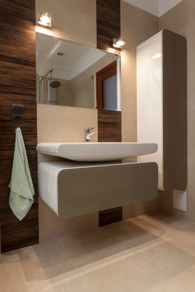
This bathroom features a light tile floor, with sections of tile that run up the wall behind the sink, and around the corners of the room. The floating sink is very wide, and is suspended just below a mirror. Artificial lighting provides most of the light for this space.

This bathroom features a light tile floor, with sections of tile that run up the wall behind the sink, and around the corners of the room. The floating sink is very wide, and is suspended just below a mirror. Artificial lighting provides most of the light for this space.

Large tile covers the floor and wall behind the sink in this bathroom, while in the shower smaller square tiles show some variation of color. Across from the sink and toilet area, there is a towel rack and a window, which allows natural light to flow into the room.1

Large tile covers the floor and wall behind the sink in this bathroom, while in the shower smaller square tiles show some variation of color. Across from the sink and toilet area, there is a towel rack and a window, which allows natural light to flow into the room.

See more of this home here. Designed by Villa Chic.

This angle focuses on the floating sink and the shelving unit just below. Still, you can see the transition from large tiles on the bottom of the walls, moving up to long vertically oriented tiles just above. The shower has a glass surround with convenient soap dispensers within.

This angle focuses on the floating sink and the shelving unit just below. Still, you can see the transition from large tiles on the bottom of the walls, moving up to long vertically oriented tiles just above. The shower has a glass surround with convenient soap dispensers within.

Artistic appeal is flourishing in this bathroom. The paintings on the wall are abstract, but suggest flowers or roses. The mirror reflects the design on the wall and adds to the effect. Just below the mirror, the large floating sink holds a small elegant vase with blue flowers to help accent the space.

Artistic appeal is flourishing in this bathroom. The paintings on the wall are abstract, but suggest flowers or roses. The mirror reflects the design on the wall and adds to the effect. Just below the mirror, the large floating sink holds a small elegant vase with blue flowers to help accent the space.

Source: Zillow Digs™
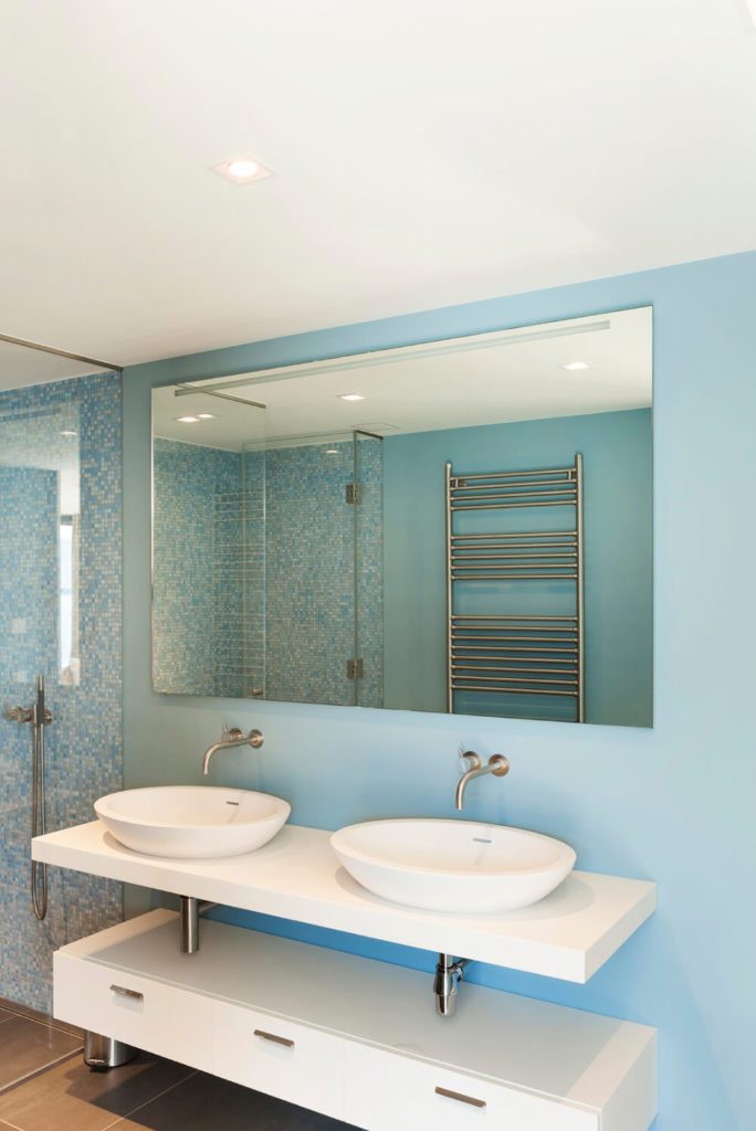
Small square blue tiles cover the interior of the shower, while the walls transition to a solid baby blue behind the sinks and mirror. Beneath the floating sinks there is a set of white drawers that provide plenty of storage space. In the reflection of the mirror, you can see a chrome towel rack on the opposite wall.
Small square blue tiles cover the interior of the shower, while the walls transition to a solid baby blue behind the sinks and mirror. Beneath the floating sinks there is a set of white drawers that provide plenty of storage space. In the reflection of the mirror, you can see a chrome towel rack on the opposite wall.

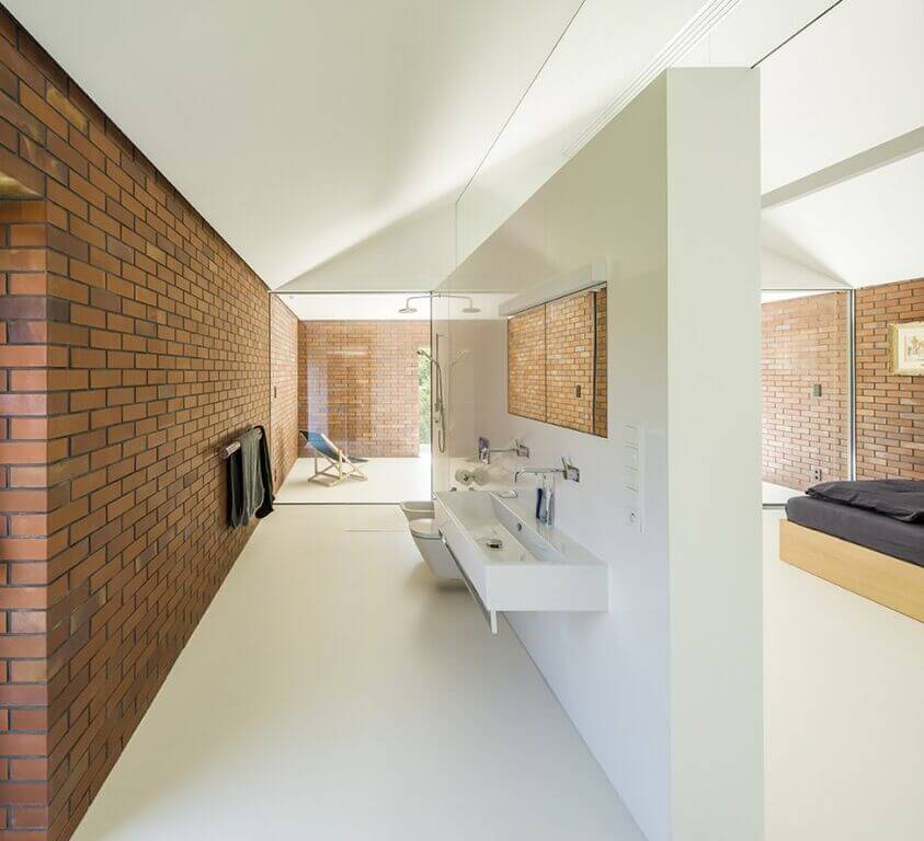
This bathroom takes up a large space, with a large white wall separating the bathroom area from the bedroom. While the walls consist of a traditional red brick, the floors and separating wall are stark white, providing a healthy balance for the space. A trough style floating sink is featured on the inside of the separation wall, as well as a glass walled shower on the far end.

This bathroom takes up a large space, with a large white wall separating the bathroom area from the bedroom. While the walls consist of a traditional red brick, the floors and separating wall are stark white, providing a healthy balance for the space. A trough style floating sink is featured on the inside of the separation wall, as well as a glass walled shower on the far end.

See more of this home here. Designed by Robert Konieczny — KWK Promes.

This bathroom has dark tile walls with reflective surfaces. This makes the space seem very modern. A glass walled walk in shower is featured at the far end of the room, while a floating sink is mounted on the wall to the left.


This bathroom has dark tile walls with reflective surfaces. This makes the space seem very modern. A glass walled walk in shower is featured at the far end of the room, while a floating sink is mounted on the wall to the left.
Categories
Post

Plans and elevations

Plans and elevations

Discover the Design For Place features and specifications, and download the plans and elevations.

If you decide to build, adapt or use Design For Place for your project get in touch. We are keen to collect your stories, pictures and videos to share on the site—and hope to provide options to interact with other users building with Design For Place soon.

Design features

Design For Place showcases sustainable, modern design. The architect-designed house plans feature a large main bedroom with a generous walk-in-robe (WIR) and ensuite. There is also an open plan living and kitchen area with cathedral ceilings, bathroom and laundry. The flexible, functional floor plans are available for longer blocks in two size options: 3 bedroom plus study (Option 1A) and 2 bedroom plus study (Option 2A), both include a single car garage.

3 bedroom with study floor plan

Features include the dramatic ceiling line, extra highlight windows, and generous room sizes including a study capable of accommodating two adults working together. The study can also be used as an additional bedroom.

If your block has north to the street a 3 bedroom + study courtyard house (Option 3A), is also available (floorplan only). Central courtyards assist in providing opportunities for north-facing glazing on the majority of living spaces, you will need to develop elevations and full plans for this option.

Other features include:

  • Reverse brick veneer construction in selected locations and a burnished concrete slab to give high levels of internal thermal mass.
  • Significant amounts of good quality north-facing glass to provide high levels of natural light in winter and a good connection to outdoor living spaces.
  • Open, generous living spaces that provide some flexibility in furniture arrangements and a good sense of liveability.
  • Large overhangs and eaves in appropriate locations—these can be adjusted in size to respond to different climate conditions where needed.
  • Sun-hoods to east and west windows to assist in control of solar gain in summer.
  • Openable windows and doors on multiple sides of most rooms to allow for good levels of natural cross- ventilation.
  • High openable windows over north-facing sliding doors to allow for night-time flushing of hot air when required.
  • Generous bedroom sizes to provide options for bed sizes and inclusion of desks if desired.
  • Good opportunities for integrated storage, including significant storage in the garage.
  • A combination of lightweight and masonry external cladding to provide additional interest to the exterior.
  • A southern courtyard that can be used as a refuge in summer and assist in cross-ventilation of main living spaces when required.

The 3 bedroom + study (Option 1A) is a single detached dwelling suitable for a typical suburban block of just over 500m2, with north to a side boundary. The design is aimed at providing a compact, energy-efficient and flexible home.

The 2 bedroom + study (Option 2A) is a single, detached dwelling suitable for a typical suburban block of just over 500m2, with north to a side boundary. The design is aimed at providing a compact, energy-efficient and flexible home that appeals to families and ‘down-sizers’.

For details of all the materials and finishes view the full specifications.

The key features of Options 1A and 2A are:

Design specifications
Option Bedrooms Study Garage Bath Area (m2) Garage (m2) Total area (m2)
3 bed + study (1A) 3 1 1 2 172 22 194
2 bed + study (2A) 2 1 1 2 141 28 169
Categories
Post

32 Modern Home Designs

 Here is a photo gallery of 32 modern home designs that exhibit extraordinary architectural and design talent. Diverse design. Easy-to-scroll gallery.

Geometric top-heavy concrete home built on edge of steep slope

Welcome to our photo gallery of 32 modern home designs.

I remember viewing my first modern home that was built in the smallish town where I grew up.  There is a mountain on the east side of town where large homes were built.  It was the premiere neighborhood in our town because the views are incredible.

Far up the mountain in the late 80’s a family built a modern home that deviated from the usual West Coast style of homes that were popular on the mountain.  The sparkling new white cube-style home with cliff-edge pool shone like a jewel on the mountain.  I was smitten… and often went up the mountain to enjoy the views and the homes.

Our modern home designs gallery below features a range of modern homes with respect to design and architecture.  Some of our featured homes are truly modern in the strict sense of the word while others are contemporary in design.

Top-heavy geometric concrete home in daylight
Image 2: Top-heavy geometric concrete home in daylight
White modern home built with straight lines with large backyard pool
Sprawling one-story modern home with extensive backyard pool


Click here to view another luxurious modern home!

Concrete modern home built into a small hillside
Large contemporary 3-story home on cliff-side built on concrete stilts with multiple decks
White multi-story ultra modern home on extensive slope with garage entry on the bottom
White modern home with dark windows on large grass lot with in-ground swimming pool
1-story modern contemporary home with wood pillars and large courtyard swimming pool
Concrete tower home
Concrete tower home
3-story heavily windowed contemporary home with multiple decks
Vertically rambling geo-shape white modern home built on sloped street
Modern brick and wood home with floating patio over swimming pool
Rectangle straight-lined modern home with large grass backyard and long lap swimming pool
White home with floor-to-ceiling glass built on hillside
West Coast modern wood and glass home with garage entry below the home
West Coast modern wood and glass home with garage entry below the home.
Modern grey home in vertical L-shape with large backyard patio
3-story towering modern home with extensive windows and loft ceiling on third floor
2-story white and grey modern home with lap pool and wood deck
White geometric ultra modern home on large grass lot with trees in the background
Large white modern home with floor-to-ceiling windows
Modern wood and glass home on flat grass lot with extensive windows on ground floor
Large rectangle modern home in white with extensive windows on ground floor and large backyard swimming pool

We love the gorgeous pool in the above shot….click here to see more fabulous backyard swimming pool designs and ideas!

4-story white modern home built on rocky slope on the ocean.
Red and white modern home built in a series of cubes with large upper floor roof-top deck
White modern home with lap pool and wrap around wood deck

Don’t miss our special gallery on wooden decks for more great ideas for your outdoor space!

Large 2-story modern beach house built on sand dune with wrap-around deck and green roof

See another gorgeous cliff-side project from one of our partners!

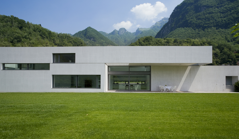
Modern mansion in white with large closely cropped grass yard situated at the base of mountain
L-shaped modern home with pool in the crook of the L and large 2-story wrap-around deck
3-story white modern home design on the beach in the tropics with palm trees in the front yard
Modern home design illuminated at night. Home is cube-shaped
4-story white all-glass modern home cascading down the slope of a steep hill with ocean views

2-story modern prairie style home with large great roomThe above home is a good example of modern prairie style.  The center of the home is the massive great room with the towering 2-story window

Categories
Post

The 8 most expensive and insanely fast supercars in the world

The 8 most expensive and insanely fast supercars in the world

Most Expensive Cars In the World

If there’s one thing we learned from endless episodes of MTV Cribs back in the day, it’s that athletes, rock stars, and A-list celebrities are all bonded by a common interest: A love and passion for fast and expensive cars.

While everyone is likely familiar with expensive cars from the likes Porsche and Rolls Royce, there exists a subset of supercars which are so expensive that they even make a regular Ferrari seem affordable by comparison. At this level, we’re not talking about cars that cost somewhere in the multi-hundred thousand dollar range. Quite the contrary, my friend. No, at this level we’re talking about cars that sell for 7 figures and can easily hit 200 mph on the speedometer.

To get you acquainted with the types of cars the wealthiest in the world keep in their garages, listed below are the 8 most expensive supercars in the world.

DON’T MISS: iOS 9.3: How to fix some of the annoying bugs plaguing your iPhone

Koenigsegg CCXR Trevita – $4.85 million

koenigsegg ccxr trevita

Nearly $5 million for a car? Not to worry, the Koenigsegg CCXR Trevita is coated with diamonds. No, seriously. The body of the Trevita sports a pretty awesome visual appearance due to a diamond weave white carbon fibre body.

The company boasts: “For the Trevita, Koenigsegg developed something truly special. This is not paint. It’s not a tint. It’s actually white carbon fibre that shines like millions of diamonds when the sun hits the car.”

Under the hood is a 4.8-liter V8 yielding which offers up 1018 horsepower and a top speed of 254 mph. Only two models were ever produced so good luck finding one even if you have that much coin to waste, uh, I mean spend.

The car was highlighted by Jay Leno last year during a pretty fascinating episode ofJay Leno’s Garage, viewable below.

Lamborghini Veneno Roadster – $4.5 million

Lamborghini Veneno Roadster

With only 9 units ever made, calling the Veneno Roaster a limited edition vehicle might even be misleading. The car delivers 750 horsepower and can reach a top speed of 221 mph.

Bugatti Veyron Grand Sport Vitesse – $3.5 million

bugatti veyron grand sport vitesse

This car is insanely fast and can handle well at speeds exceeding 180 mph. This Bugatti can floor it at over 250 mph and as we highlighted previously, “the only thing preventing the car from going faster than advertised is that Michelin’s hasn’t yet figured out a way to keep its tires from exploding once they reach a consistent speed of 270 mph.”

Not only is the Bugatti Veyron wildly expensive, it’s also the most expensive car in the world to maintain. That fact, however, didn’t stop Floyd Mayweather from picking one up a few months back.

W Motors Lykan Hypersport – $3.4M

lykan hypersport

Though W Motors may not be a household name – the company was founded in Lebanon and is now based out of Dubai – its Lykan Hypersport is a supercar that impresses on all fronts. In keeping with the ‘limited edition’ motif we have going here, only 7 models of the car were ever manufactured.

For $3.4 million, you might not be surprised to learn that “each LED headlight is encrusted with 220 diamonds or a combination of any other precious or semi-precious stone chosen by the client.” Some of the other stone options include rubies, yellow diamonds and sapphires. Also not a surprise is that the car had a cameo appearance in the movie Furious 7.

The car has a reported top speed of 248 mph.

Video of the car in action can be seen below.

Pagani Huayra BC – $2.8 million

pagani huayra bc

Only 20 models of the Pagani Huayra BC were ever made. The car can reach a top speed of 238 mph and recently made its debut at the Geneva Motor Show

And check out those doors.

Koenigsegg One:1 – $2.8 million 

Koenigsegg One-1

Forget 0-60, the 2015 Koenigsegg One:1 can go from o to 250 mph in 20 seconds flat. The car has an out of this world top speed of 273 mph, making it the fastest production car in the world. Only 7 vehicles were ever manufactured, with 4 units earmarked for Asia, two for European customers, and just one for the U.S.

Ferrari FXX K  – $2.7 million

ferrari fxx k

Okay, so the FXX K isn’t street legal, but it’s still one sleek looking car. Only 32 models of the car were ever manufactured and they were sold rather quickly. Speed wise,  the FXX K can top 217 mph, making it the fastest Ferrari ever produced.

Ferrari F60 America – $2.5 million

Designed to commemorate Ferrari’s 60th anniversary, the F60 is an absolute beast of a vehicle. Another limited edition car, only 10 were made available in the United States. The car boasts 730 horsepower and has a top speed of 211 mph.

Categories
Post

Whats is True Sustainable Design, And what we should do ?

When It Comes to Sustainable Design, Architects Still Don’t Get It

When It Comes to Sustainable Design, Architects Still Don't Get It, Perkins + Will's Centre for Interactive Research on Sustainability, which won the RAIC's Green Building Award last year. Image © Martin Tessler
Perkins + Will’s Centre for Interactive Research on Sustainability, which won the RAIC’s Green Building Award last year. Image © Martin Tessler

In the face of global doomsday predictions, sustainability has become one of the most crucial aspects of the 21st century, now playing a huge role in everything from politics to the way you dispose of your trash. Fortunately, most architects understand sustainability implicitly, and have adopted it into their lives and work. Or have they? In this article, originally published on Common Edge as “Why Architects Don’t Get It,” green building expert Lance Hosey highlights the failures of the architecture community in reaching their stated sustainability goals, and argues for a new conception of architecture in which good design and sustainable design are integrated.

A few years ago, the American Institute of Architects, the self-declared “voice of the architecture profession,” announced that “AIA members will no longer need to complete the sustainable design requirement to fulfill their AIA continuing education.” Why? Because “sustainable design practices have become a mainstream design intention.” Hooray! If sustainability is “mainstream” now, and knowledge about it is no longer necessary “to maintain competency” and “to advance and improve the profession”—the purpose of continuing education, according to the AIA—then the profession must have met its environmental goals, and there’s nothing left to improve. Mission accomplished.

If only.

Save this picture!
NASA Sustainability Base by William McDonough and Partners. Image © William McDonough + Partners

A decade ago, the AIA adopted the 2030 Challenge, which seeks carbon neutrality by that year. Since buildings account for nearly half of the energy and three quarters of electricity consumed in the US, this is an essential aim. In Paris last fall, the world’s leaders committed to cutting greenhouse gas emissions dramatically, and they cannot accomplish this without the building industry. In 2009, the AIA launched the 2030 Commitment to give architects a framework for reporting their projects, and it began collecting this information for the year 2010. In the five years for which data is available (2010-2014), the volume of projects reported has multiplied more than 700 times (from 3.4 million square feet to 2.4 billion), providing a progressively clearer snapshot of the profession. To get to a 100% reduction in fossil fuel consumption by 2030, the target for those years was 60%. So how are we doing?

During that time, the average energy reduction in AIA member projects flatlined around 35%. The highest average in one year (2012), was 37%, 22 points below the target. In fact, in the first year after the AIA “sunsetted” sustainable design requirements, energy performance went down three points. Furthermore, the AIA lists over 80,000 members in nearly 18,000 firms, while some 360 firms have signed the 2030 Commitment, and a little over a third of those (140) actually reported energy data for 2014, according to the latest reports. In other words, only 2% of AIA member firms have committed to pursuing carbon neutrality, and less than 1% are actually reporting on their progress. So much for the mainstream.

A 2009 poll revealed that a third of architects are skeptical about climate change, and 13% believe it’s “a myth.” While these numbers generally align with the larger public’s attitudes about global warming, they don’t suggest that architects are leading the conversation. Furthermore, if two thirds of architects believe in climate change, why have only 2% signed the 2030 Commitment? What’s holding us back?

One possibility is a lack of education. Perhaps the most common criticism about green building is that it costs too much. In a 2008 survey of over 700 construction professionals, 80% cited “higher first costs” as the biggest obstacle to green building. Yet, evidence increasingly shows that higher performance need not mean higher costs. The National Renewable Energy Laboratory calculates that adopting current best practices can achieve 50-60% energy reduction—at no additional cost. How are architects supposed to learn how to do this, if the AIA considers sustainable design education unnecessary?

Save this picture!
Peter Eisenman's City of Culture. Eisenman has said that "'Green' and sustainability have nothing to do with . Image © Duccio Malagamba
Peter Eisenman’s City of Culture. Eisenman has said that “‘Green’ and sustainability have nothing to do with . Image © Duccio Malagamba

Lack of leadership is endemic in the profession, and many of the most famous architects dismiss sustainability outright. “‘Green’ and sustainability have nothing to do with architecture,” National Design Award winner Peter Eisenman has said, and Pritzker Prize winner Frank Gehry once called green building standards “bogus.” Gehry since has said that “green building is clearly something architects need to be concerned with,” but his work hardly shows it. James Wines, author of Green Architecture, has called Gehry’s work “mind-boggling waste.”

When many of architecture’s leaders fail to take today’s most urgent challenges more seriously, how can we expect the profession’s rank and file to do so?

Save this picture!
Frank Gehry's Walt Disney Concert Hall. James Wines has called Gehry's architecture "mind-boggling waste". Image © Gehry Partners, LLP
Frank Gehry’s Walt Disney Concert Hall. James Wines has called Gehry’s architecture “mind-boggling waste”. Image © Gehry Partners, LLP

If some architects don’t believe sustainability is essential, what do they believe? “I deeply consider architecture as an art—the most abstract of all of them,” AIA Gold Medalist Santiago Calatrava told a reporter last year. As I wrote in the Huffington Post in November, the architect-as-artist is one of the most enduring myths of the profession, and it justifies the most damaging and wasteful extravagances. Can we seriously hope that starry-eyed architects will tackle real-world problems when they’re so busy dreaming of “art”?

Metropolis magazine once asked its readers, “When will all design need to incorporate sustainable practices to be considered ‘good design.’” Over 80% said it would happen within 8-9 years, and half those said within 2-3. That was 2002. In 2010, for my then-column in Architect magazine, I surveyed fifty sustainable design experts to identify the “greenest buildings” of the past few decades and compared the results to a Vanity Fair poll on the “greatest buildings” from the same period. Not one building and not one American architect appeared on both lists. Standards of “good design” and “green design” are far from aligned.

Save this picture!
Ronald Lu and Partners' Zero Carbon Building, an example of a building in which its sustainable credentials are key to the architectural expression of the design. Image © Ronald Lu and Partners
Ronald Lu and Partners’ Zero Carbon Building, an example of a building in which its sustainable credentials are key to the architectural expression of the design. Image © Ronald Lu and Partners

From Eisenman to Calatrava, the profession considers the science of building divorced from the “art” of architecture. In Consilience, E.O. Wilson writes that the perceived conflict between art and science inevitably undermines sustainability: “until that fundamental divide is closed…the relation between man and the living world will remain problematic.”

I wrote my book, The Shape of Green: Aesthetics, Ecology, and Design (Island Press, 2012), to address a simple question: Does sustainability change the face of design, or only its content? Conventional wisdom is clear: “Sustainability has, or should have, no relationship to style,” claims Rafael Viñoly. AIA Gold Medalist Cesar Pelli has said that architects value “the looks” of a building, and “sustainability doesn’t necessarily photograph.” But consider this: studies show that up to 90% of the impact of a building or product is determined by the earliest design decisions: location, orientation, massing, form, fenestration, etc.

Save this picture!
Kfw Westarkade by Sauerbruch Hutton. Image © Sauerbruch Hutton

Furthermore, pursuing sustainability can inspire great innovation. For the KfW Westarkade in Frankfurt, Sauerbruch Hutton shaped the tower like an airfoil, minimizing solar exposure at the southwest and conveying breezes across the surface to aid passive ventilation. The result is one of the most elegantly efficient buildings in Europe, achieving a 70% energy reduction below standards: Form and performance merge.

Categories
Articles Learning

How to learn Blender 3D in under 24 hours

How to learn Blender 3D in under 24 hours

Until the day when desktop holography becomes a reality, 3D will remain the wholly grail of the graphics world. But 3D can be a very technical craft. And each 3D program has its own idiosyncrasies, making it all a bit daunting.
I cut my 3D chops on many programs that are now long dead and forgotten. Blender is one program I’ve wanted to learn for many years. I’ve even downloaded and installed it a few times, but fell short on the follow-through to learn it. Writing this article is my personal impetus to finally get to learning it. Perhaps it can be your impetus as well. Let’s see where we can take this in just 24 hours.
Why choose Blender?

Blender has many qualities that include years of steady development, a prized commodity in either commercial or open source projects. This has netted a broad range of capabilities, beyond even its full range of 3D modeling and animation tools.

For example, Blender has video editing, camera tracking, compositing, and even game creation tools all built right in. The fact that it’s open source and completely free is also an unbeatable perk! (Though donations to the Blender Foundation are a good idea.) With all this power, Blender’s toolset is often directly compared to top programs in the 3D field costing thousands, like Mayaor 3ds Max.
Naysayers may complain it lacks centralized support, since there is no commercial publisher with a help staff. However there is ample support onlineon many sites, and even a real time IRC chat option. This means nights and weekend support too! Plus, the Blender community can be uniquely generous with its help.

The other knock is Blender’s much smaller market share, which means there are perhaps fewer companies looking to hire Blender artists. Having said that, know that this is changing and there are sites like the Blender Network that specialize in matching Blender artists with employers. And even mainstream job sites are getting more Blender savvy every day.

None of this is even an issue if you run your own shop or are just doing your own thing. Then all that matters are the final renderings. And few clients know or care about all this techno-geek talk.

Blender’s own jobs website, and it’s gaining ground on other job boards as well

My first hour with Blender: installing and learning the interface

I went up to Blender’s website , clicked on the ‘Download’ link, and chose between the installers available for Mac, Windows, Linux and even FreeBSD. (And made a small donation while there!) Installation was almost crazy-easy, and fast. Which is common for most open source programs.

Blender splash page

Once installed, I booted it up like a kid on Christmas morning. The splash page had a number of links, including one to the official Blender manual online. The manual is an excellent resource, but perhaps a bit better suited to those that already have an introduction to both 3D and Blender.

Blender’s official online manual

Upon first viewing, Blender’s interface can be overwhelming. But it isn’t as complicated as it first looks. Once you understand the logical thought process it becomes much less daunting. Logic-wise it’s rather similar to Adobe programs like Photoshop or InDesign.

Blender’s default user interface. See the text for a quick explanation of its UI

The default Blender interface is made up of four areas. (A) in the image above is called the Toolbar, a collection of the most commonly used tools. (B) is the 3D Viewport, or work window. (C) is a vertical stacking of many control/preference/properties interfaces, which again, is just like Adobe products you know. (D) is the timeline, for animation work. You might be familiar with this from programs like After Effects.

Understanding these basics makes Blender all the more approachable. Although not necessarily more useable. Before looking at any instructions, I felt compelled to muck about with the buttons, doodads and doohickeys, and hoped to find my way around. But I’ll admit that I wasn’t too successful. I began to realize that Blender wasn’t quite as intuitive – at least for me – as I had hoped.

So I started to explore what alternative ways I could go about learning it, beyond the button-poking. I quickly found out there are quite a few learning options out there.

An extreme example of multi-monitor support

Hours two-four: organizing my education

Starting my second hour with Blender, I began hunting for ways to learn it. I started out the way many of you would, by looking online for books. A quick search turned up dozens of books which included titles such as ‘Blender 3D Cookbook’ and ‘Blender Basics’ (both from PACKT Publishing), and ‘Blender for Dummies’ (John Wiley & Sons), all recently published as print and Kindle editions.

I ordered a few of these books for download. Which books best fit your learning style is up to you. As might be expected by the title, the ‘Dummies’ books take extra pains to make easing into a new subject as painless as possible, so are a good place to start. But they also tend to not go as deep as other offerings. All the books were well written and took me step by step.

And while I began learning from these books, I had to acknowledge that whether it’s our cultural evolution, or just me getting older, I found it harder to read this tech material than I used to. So I began looking for other ways to learn.

Hours four-10: video education, part one

Again, I didn’t do anything different here than most of you, I went trolling around YouTube with search phrases like ‘learn blender’, which gave a return of 157,000 videos. I’m sure most had more to do with making a good smoothie, but still, there were hundreds on Blender 3D.

An advanced subject: creating a city in Blender

Some of the most popular Blender tutorial channels included Blender for Noobswith over 27k subscribers, Blender Guru with over 153k subscribers (see the amazing architecture video!), and tutor4u with over 172k subscribers.

Pure fun: Minions in Blender!

Jacob Lewis offers a 2014 updated 10-part video series called ‘Blender Absolute Beginner Tutorial’ with about 380k subscribers. One video that is seriously worth a look is Max Coulfield’s great Blender sculpture timelapse.

‘Sculpting’ a young female head and shoulders

I spent time finding and then watching many videos, and at this point I had clocked in roughly 10 hours of working on the Blender project, across two or three days. Trying to do it all in one day would surely have exploded my tiny head.

Hours 10-15: video education, part two

After viewing YouTube tutorials for a bit, I will admit to a bias against any that begin with “Yo-yo fellas… wassup?” An experience that can leave you wanting more formally prepared material.

So I finally did something that many of you might not actually do. I contacted Ton Roosendaal, the original creator of Blender, and now the Chairman of the Blender Foundation. He was gracious and we exchanged a number of emails. At his suggestion, I got in touch with Jonathan Williamson, a co-founder and instructor at CG Cookie, an online computer graphics video education resource. CG Cookie has courseware for Blender, as well as other subjects like creative concepting and Unity game development.

CG Cookie offers online video courseware on Blender

CG Cookie offers what they call ‘Learning Flows’ for Blender, which contains 141 separate video installments. These are broken down into 9 sections, with topics like modeling, lighting, etc. The first module in the series is ‘Blender Basics’, which they make available at no cost. It contains six videos that run about a half hour total. Over the next few days I watched the intro videos, and as many of the follow-up sections as I could. All the while popping back to Blender to try things out.

Hour 15 and beyond…

I also touched base with Anja, who runs the Blender Shop on blender.org. She provided a long list of Blender learning resources, which we have reprinted at the end of the article.

So by the time I was nearing my 18th hour with all of this, I was feeling like I was in a fairly good place. By that I mean I could navigate around the interface with aplomb, I could create, modify, and texture map models (with limits on complexity), light them, and render out basic animations. In other words, I could knock out basic day-to-day 3D work. No character modeling, video editing or compositing, I’ll leave that for another day.

If this was for myself instead of an article it would have gone faster. One book and one video series would have been fine. I’m sure you’ll keep things simpler.

So what are you waiting for? Download it now, and let us know how your learning curve goes!

Resources (from Anja at Blender Shop)

A good way to learn Blender if you don’t have experience with 3D
programs is to start with Blender’s own tutorials and manual.

You can find lots of free tutorials on the internet about learning Blender.

  • Here are some links with lots of information:
    http://wiki.blender.org/index.php/Doc:2.6/Tutorials

    Links


    http://wiki.blender.org/
    http://cgcookie.com/blender/
    http://www.blenderguru.com/

  • Free book link: http://wiki.blender.org/index.php/Doc:2.6/Books
  • The Blender Art Magazine, free for download.
  • Free Blender Basics – Introduction for Beginners (video tutoiral)
  • Free Blender Basics Book for version 2.5/2.6 and 2.49
  • An Introduction to Blender 2.59 free eBook
  • Free Blender 3D Tutorials/e-books in PDF format
  • Free: A Blender Quickstart course, a tour of Blender’s modeling, uv mapping, rigging, animating, and rendering
  • Free Blender 3D Design Course
  • Free Blender tutorials & training
  • Free video tutorials 2.5
  • Free video tutorials
  • Blender hotkeys:
    http://www.foreverblender.com/2010/02/blender-25-all-hotkeys.html
    http://www.katsbits.com/tutorials/blender/useful-keyboard-shortcuts.php
    http://blendertips.com/hotkeys.html

If you have questions about using Blender you can always place them on the forums.

Words: Lance Evans

Lance Evans is creative director of Graphlink Media.

Liked this? Read these!

  • Google Chrome dumps old plugins – what this means for you
  • How to build an app: try these great tutorials
  • Free graphic design software available to you right now!
Categories
Post

Top 10 Apps for Architects

 Top 10 Apps for Architects

Following our readers poll last year, here’s an updated list of what we think are the best ten apps for architects. From condensed versions of large scale programmes architects and designers use every day, to blank canvases to scratch ideas down onto, you might just find an app that could improve the way you work.

#10 Photosynth (iOS/Windows)

If you’ve ever been on a site, or in an interesting location, and are bored of flat panoramas then this app holds the answer. It’s user friendly and, once you’ve stood in one position and circled for a while, it stitches a collection of photos together and gives you a great 360degree panorama.

#9 AutoCAD 360, formerly AutoCAD WS (iOS/Android)

Get all your CAD plans on a mobile device. It’s simple and easy to use. They do require a ‘Pro’ subscription for some features.

#8 iRhino 3D (iOS)

Save this picture!
iRhino
iRhino

Using this app you can view any Rhine 3DM file on your mobile device. It’s a great way of showcasing your models.

#7 Autodesk Formit (iOS/Android)

As a subsidiary of Autodesk Revit, this app allows you to create and alter BIM models on mobile devices.

#6 Morpholio / Morpholio Trace (iOS)

Save this picture!
Morpholio Trace
Morpholio Trace

The Morpholio Project is really interesting and offers an insight into where skilled app designers can go with a good idea. Trace is an architect’s best friend and they offer an app that does just that – you can read an ArchDaily review of it here.

#5 Adobe Ideas (iOS)

Save this picture!
Vector based sketching

This app gives a few tools to jot down ideas quickly and efficiently. It doesn’t provide as many export options as our #4, but does work well on both iPhone and iPad.

#4 Sketchbook (iOS)

This app (designed by Autodesk) offers you sketching freedom coupled with useful ways of exporting drawings on different canvas sizes and at different resolutions. It might feel as user friendly as our #1 app choice, but it’s certainly useful.

#3 Graphisoft BIMx (iOS)

Introducing Hyper-models – Graphisoft’s term for describing BIM on mobile devices – has the potential to make BIM even more popular. As an app that can be used by every member of a project’s design and construction teams, it’s worth checking out.

#2 MagicPlan (iOS/Android)

MagicPlan is, well, magic. It takes advantage of the devices camera and augmented reality to create floor plans of rooms. All you have to do is stand and point your device and it does the rest of the work. You can then export these drawings as a PDF, JPG, or DXF. It takes a bit of getting used to at first but, once mastered, is quite accurate.

#1 Paper (iOS)

With five tools and a blank canvas, coupled with as many virtual sketchbooks as you want, Paper is one of the most loved mobile sketching apps. Having won Apple’s App of the Year and been given the 2012 Apple Design Award, the app has also been extensively reviewed by The Verge. It’s fast, easy, and responsive.

Categories
Post

10 free resume templates

10 free resume templates

Not all of us have the time or inclination to craft our own creative resumes, and arguably having a flashy or beautifully illustrated curriculum vitae printed on 130gsm paper is of far less importance than a well-presented design portfolio.

But your CV still needs to clearly impart key information about your career, while still displaying a little of your personality. We’ve had a search around and have found these 10 free résumé templates, each of which offers something a little different. Here goes.

01. Ikono.me

Resume and CV templates
A stylish resume template that includes a timeline of your employment history

This subtle yet stylish CV template features all the details you need to include, along with a neat sidebar holding a profile and references and a timeline – in which you can list your employment history. There’s also an online profile section to show just how social media-savvy you are and a software skills bar graph so you can show your exact skills. It’s supplied in PSD, AI and INDD formats.

02. Three in one

Free resume templates

This simple, elegant free resume template is one of many presented by Designscrazed. The design is separated into easy-to-read, clear section with an option at the bottom for you to add icons to list your hobbies and interest, which gives it a nice touch. The zip file contains three psd files to build your personal resume, cover letter and a portfolio web template should you wish. All layers are well grouped and easily edited in Photoshop.

03. Ultra minimal résumé

Resume and CV templates
Print on a different paper colour for added minimalism with this CV template

A lot of the time, less is more when it comes to CV and resume design – and this subtle, minimal template is perfect for communicating your work history and profile in style. There’s room for a photo (we’d suggest black and white) and you can either change the background colour or print onto coloured paper for a unique and stylish CV.

04. Résumé for icon fans

Resume and CV templates
This resume template has some super-stylised icons included

If icons are your thing, check out this free template (only free for a limited time, mind) from designer Fernando Báez. A sectionalised design, complete with stylish type and icons included (you get the CV in AI format and the icons in PSD), this resume is perfect for customising with your own icons to represent your interests and achievements.

05. Résumé for type fans

Resume and CV templates
A central typographic column enables you to list your skills

Sure, this may not be to everyone’s taste – but it’s certainly impactful. A central typographic column bursts out to boxes in which you can add your details. The resume is supplied in AI format so you can easily export a PDF – and comes in black and white so you can get creative with colours.

06. Simple résumé

Resume and CV templates
Open Sans is at the heart of this resume, making it easy to customise

Again, simplicity is the key here in a type-based CV (using Open Sans) that puts profile at the top, then lists experience and education in simple boxes with left-hand sub-headers. There’s also – and this seems to be a trend amongst résumé designers – a professional skills section enabling you to grade yourself out of five on software, code and the like (stick them all to five if we were you).

07. Clean résumé

Resume and CV templates
The Smart Object header makes it a cinch to add your own graphic to this resume

This highly-customisable resume template comes in PSD and AI formats and has a Smart Object header, meaning you can quickly and easily link in an image of your choice. It’s A4, 300dpi, with 3mm bleed – so completely print-ready. Just add your logo, bio, experience and so on and you’re ready to print and send.

08. Hadi Reda

Resume and CV templates
Super-minimal with a neat icon style, this resume is ace for designers

Keep it super-minimal with this resume template. Once again there’s a bar graph for your skills (which we’re still not sure about but some employers may like it) along with a neat icon style to represent your social media profiles and software competence. It’s supplied in layered PSD format.

09. Résumé that makes a statement

Resume and CV templates
It’s definitely worth experimenting with this contemporary resume template by Paolo Pettigiani

Maybe you’re looking to make more of a statement with your one-pager – in which case this typographic template by Paolo Pettigiani may be just the ticket. Easy to customise and available in AI format with all the necessary fonts and icons, it’s definitely worth experimenting with.

10. Long résumé

Resume and CV templates
There’s so much info on this resume template it could be a little baffling – so why not cut the neat design down to size?

A modern resume with room for everything you’d need to say about yourself and more, we like the placeholders for adding imagery and your personal logo or logotype in the header. There’s also a services list, skills graphs and client box. A comprehensive PSD resume that you may need to cut down to size a little.

Categories
Articles Learning

Introduction To Auto desk AutoCAD | DAY 7

Learn AutoCAD basics: DAY 7

The present is one of a kind. It is good to know that the objective is not only to be able to useAutoCAD commands but also to use-your-brain-cells to help combine all these commands to get to the final image.

One thing you should have in mind is that there is more than a way to get to a destination using AutoCAD, just remember to check your dimensions at the end of the exercise and make sure they match ones mentioned on the image-exercise.

We will look a little deeper into the OFFSET command today. It is needed.

OFFSET COMMAND IN AUTOCAD

learn-AutoCAD

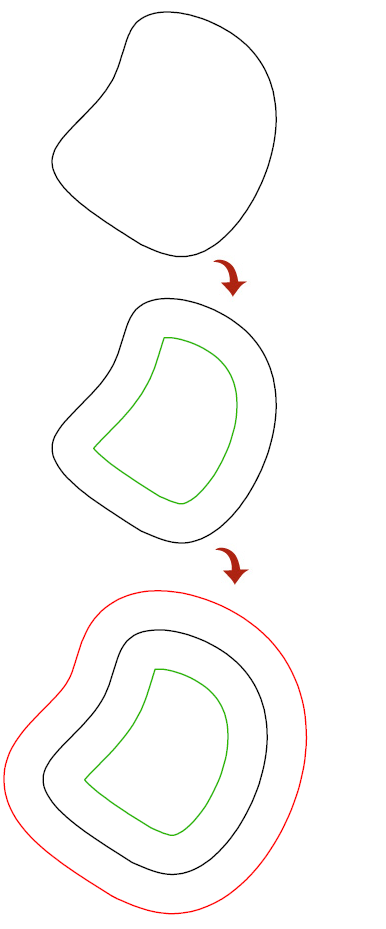
The OFFSET command helps create parallel lines and parallel curves.

If you have a object and want a similar parallel object to it, this command will be helpful.

learn-AutoCAD

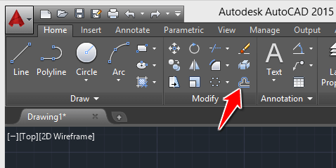
To use the OFFSET command

  1. Click on the OFFSET icon
  2. Specify the OFFSET distance and Press Enter
  3. Select object to OFFSET
  4. Specify a point on side to OFFSET

LEARNING AUTOCAD BASICS

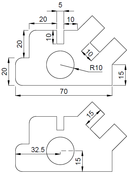
The use of the ROTATE command will be required in this exercise, as well as the OFFSET command.

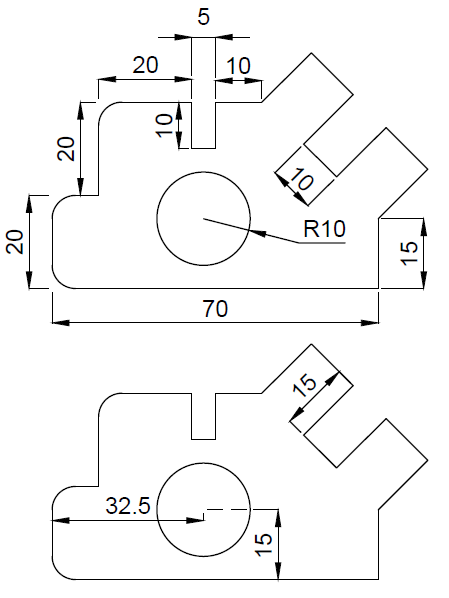
Below you will find diverse dimensions to help the replication of this session’s task.

FIGURE 1

learn-AutoCAD

FIGURE 2

learn-AutoCAD

EXECUTION

You need to start from the outer part of the object.

learn-AutoCAD

After getting the above figure done, OFFSET all circles with 10 units inwards, and OFFSET all line with 15 units inwards.

And you should end up here.

learn-AutoCAD

All you need to use the TRIM command and the FILLET command to get all done.

Categories
Articles Learning

Introduction To Auto desk AutoCAD | DAY 6

Learn AutoCAD basics: DAY 6

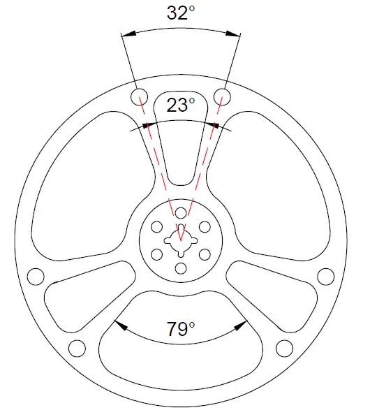
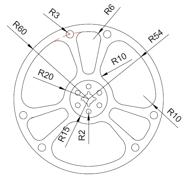
In this session we will be challenging ourselves to learn how to play with the ARRAY command in AutoCAD.

The image below is one of those that may best serve this purpose. It is to be noted that all slots are equally spaced around the circles.

Feel free to visit the post where we practiced and talked about the use of the ARRAY command in AutoCAD.

LEARNING AUTOCAD BASICS

There is not much to be done in this one but the proper use of the ARRAY command. All you will need is to have mastered the TRIM command, the LINE command, the FILLET command and theCIRCLE command.

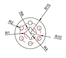
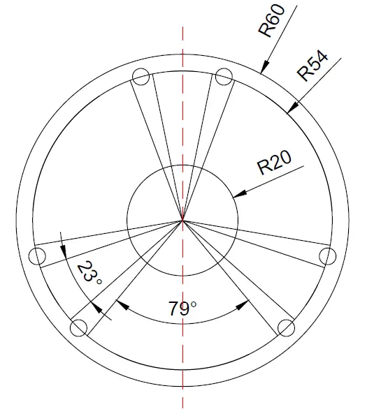
Below we have split annotations in different figures to avoid having a bushy image. Combine all information available on the figures if you want to accurately replicate today’s exercise.

FIGURE 1

learn-AutoCAD

FIGURE 2

learn-AutoCAD

FIGURE 3

Piece in the center of the exercise.

learn-AutoCAD

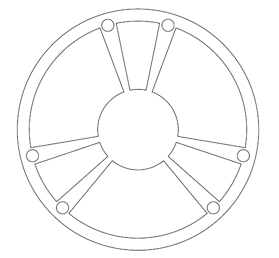
EXECUTION

The following image might be helpful to you to have a good start

learn-AutoCAD

After proper TRIMMING, you will be left with the following

learn-AutoCAD

Now all you need to do is to use the FILLET command to round edges and create objects that are in the center of the figure.

Categories
Articles Learning

Introduction To Auto desk AutoCAD | DAY 4

Learn AutoCAD basics: DAY 4

The following should have nothing new to you if you have been here since the beginning. In this session, we are going to make good use of what we have learned so far.

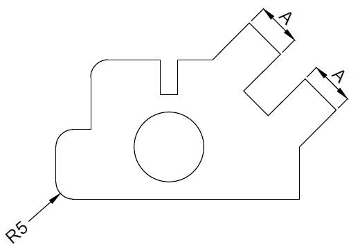
The image below will serve as today task.

All Fillet in the following exercise are 5 units. (Learn more about the FILLET command in AutoCAD)

learn-AutoCAD

LEARNING AUTOCAD BASICS

You do not need to know the dimension of A to be able to accurately replicate the exercise. But it is crucial to know that the value of those lines are the same, that is the reason we called it A.

As I said earlier, all FILLET are R=5. We have 3 FILLET in the following exercise.

learn-AutoCAD

You will need to use the UCS command to place the circle at its appropriate distance using the same technique we used in the last session.

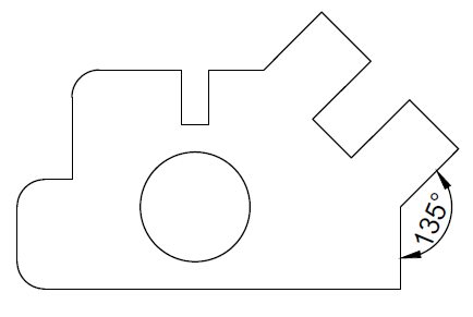
The following information will also be important to know.

learn-AutoCAD

Basically, there is nothing added than the FILLET command here. Ignore the FILLET, complete the figure and you can get those FILLET done at the end of the task.

Feel free to drop your thoughts below in case of any question or pinion.

Categories
Articles Learning

Introduction To Auto desk AutoCAD | DAY 2

Learn AutoCAD basics: DAY 2

Not like the previous DAY, we are going to start learning cool things today. Not to say that DAY 1 was useless, that helped to warm up.

We have lately learn the basic basics in AutoCAD, and you should by now know the environment and I have no doubt that you are familiar with common words used here to describe stuff such as Command window, Status Bar, Navigation bar…

LEARN AUTOCAD BASICS

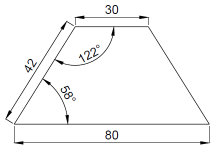
We will use the image below, and try learning all things we need to learn to be able to create something similar using AutoCAD.

We’ve learned a little how to use the coordinate system to create lines in AutoCAD. In this Session, we will forget a little about the Cartesian coordinate system.

learn-AutoCAD

It is true that using the Cartesian coordinate system we could draw lines with specified dimension, but this method is more convenient and is the one you will be making use of in the future.

Read more about how you can create lines and play with their angle

EXECUTION

To create the image above

STEP 1

Draw the line of 80 units

  1. Click on LINE
  2. Specify the first point
  3. Make sure the ORTHO mode is ON, Move your mouse rightward, type 80 and Press Enter
  4. Press Esc

STEP 2

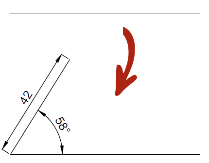
Start the second line from the first point of the 80 units line, and draw the second line with an inclination angle of 58 degrees.

learn-AutoCAD

STEP 3

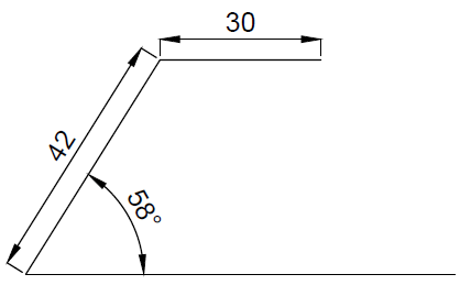
Draw the third line. It is a straight horizontal line.

learn-AutoCAD

STEP 4

All you have to do now is to create a line from the 2 open points shown on the figure in step 3.

EXERCISE

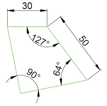
Here is a good exercise that will help you practice what we have just learned. I will suggest youlearn how to use the ROTATE command in AutoCAD before trying to do the following exercise.

Autocad-tutorial

In case of difficulties, I would like you to know that I solved this step by step few days earlier.

Categories
Post

What is Architecture ?

As an architect I am in constant flux of what it is I do. I don’t construct buildings or fund projects — I design. But what the hell does that mean?

The architectural profession has done a horrible job of conveying A) what it is that architects do, and B) why we’re even necessary to society. We can postulate the essence of architecture, and we can criticize architecture on both a theoretical and substantive level, but can we even define what architectural design means?

At least at this point in my life, and this place in time and space, I define architectural design as problem solving by adding value. To try to break it down to its most simplistic state, we design to solve a problem. But design goes beyond just solving problems. I solve problems in my black-belt Sudoku puzzle book (truth be told, I’m more like an orange belt), but that’s not design. Where’s the value to society? Who really benefits by me sitting in the bathroom filling out squares with a number between one and nine?
10848616_845398418860123_415058118555106134_o
There’s always been that faint distinction between art and architecture (at least by my turtleneck-wearing brethren), but the true difference is that art doesn’t solve a problem. Sure, it inspires the uninspired, and it ruminates the people who can’t tie their own shoes, but it doesn’t solve a problem. Likewise, architecture that doesn’t solve a problem, such as not fulfilling the intended program of the building, becomes art. If people can’t use the building, then what problem was solved? (Yes, you’ve kept the elements out, and bears are deterred from attacking the inhabitants, but if the program is not fulfilled then the building’s not very useful.)

Nestlé Chocolate Museum / Rojkind Arquitectos. Image © Paúl Rivera

I don’t want to come across as someone who thinks architecture should fulfill its utilitarian purpose and be good. I think every piece of architecture not only can inspire but should inspire. To make bad architecture into great architecture takes a little more effort (although it typically takes a whole lot more talent).